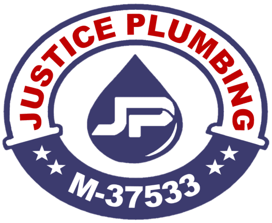
Big news! Today, after nineteen years, we’re releasing an updated brand identity, which includes a new, modern logo with our original red, white and blue colors. You’ll see the new look anywhere we’re out in public, like our website, Facebook, and on our plumbers work apparel. We believe the new look better matches what we’ve become since 2002: a provider of the most reliable, innovative, and highest quality plumbing services to Granbury homes and businesses.

Since our founding in 2002, we’ve more or less stuck with the same lady liberty logo. After nearly two decades, it was time for a change. We wanted to create something that appeared crisp, approachable, smart, friendly, and connected.
The red, white, and blue remains unchanged, as these U.S. flag colors continue to evoke patriotism and pride. They signify the qualities of the human spirit we Americans cherish, Red for courage and readiness; white for pure intentions and high ideals; and blue for vigilance and justice.
The “JP” in the middle of the logo, quite obviously, represents the company name, but it’s stylized in the middle of a water droplet to match our new slogan, “If water runs through it, Justice will do it!”
We hope you like this new look and feel for Justice Plumbing! Our design goal was to better match how we look to our values and the community we serve. As members of the community and your neighbors, we want to ensure that your plumbing is always in the best possible condition.

